Website Redesign to Build Brand and Drive Leads
Irep inc. is an award-winning global digital marketing agency based in the San Francisco Bay Area and headquartered in Japan. In 2019, they launched San Francisco office and their business offers data-driven digital solutions to diverse international clients. Utilizing data, they help to build bridges to success for customer’s businesses looking to grow in Japan, Asia, and beyond. By strengthening their online brand presence and enriching the web content, they were aiming to attract customers and to generate leads through the website.
challenge
The client requested us to redesign the corporate website to enhance their brand image. They also needed to enrich their web content to generate leads through the website.
solution
We redesigned and rebuilt their corporate website to help strengthen their online brand presence and to attract new customers. We helped to enrich the content by improving the site structure, visuals, usability, and navigations.
team/role
Designer (Myself): Plan & Competitive Research | Wireframes | Mid-fidelity Prototype | Visual design | High-fidelity Prototype
Developer: Implementation | Testing | Deployment
Duration
June - September 2020
tools used
Adobe XD | Photoshop | Illustrator
Gaining Insights about the Industry
I started the project with research to gain insights about the digital marketing industry and competitor’s websites. With the COVID-19 outbreak, there has been a large spike in online traffics and transactions. Since every business moves online, they embrace digital marketing. It is a data-driven and targeted brand promotion and delivers measurable outcomes through technology.
Digital marketing agencies focus on results-based marketing in the digital world. They will work extensively to help establish your brand authority online and that will lead to long-term sales growth. That said since they are experts in their fields and having a strong website is a must. With my competitive analysis, I also compared industry websites to find strengths and weaknesses.
Problems with the Website
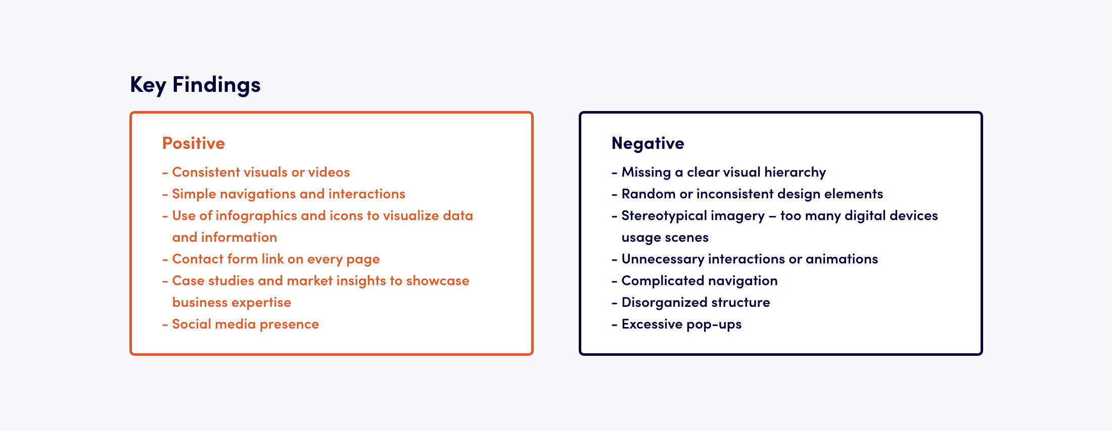
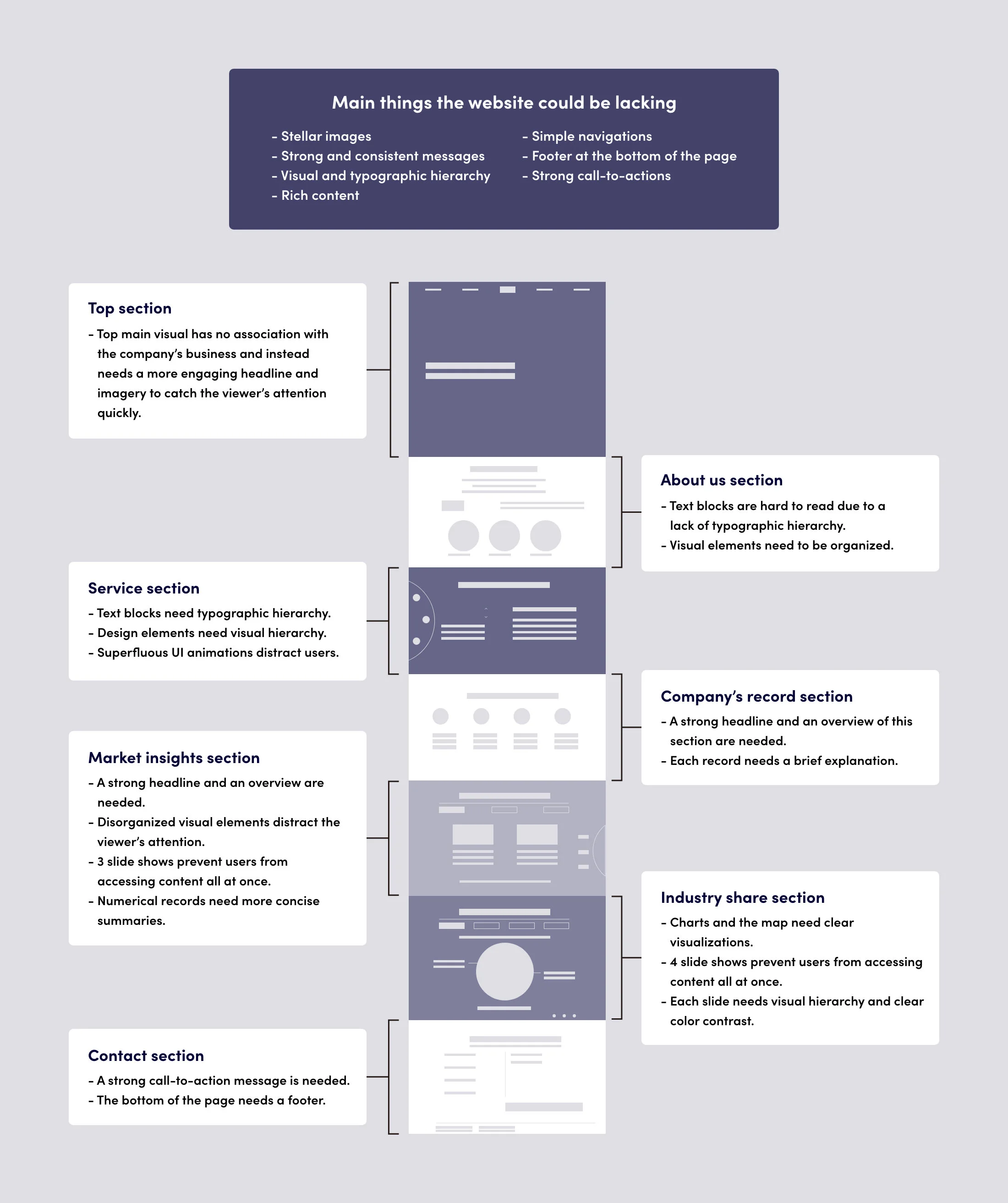
Having a website is crucial for any company because it helps to establish credibility as a business. It will be the center of the company’s online presence to represent customers the services or products, testimonials, and the facts. At the first set out, I clarified problems by analyzing each section of the website. The main issues I found were superfluous animations and inconsistent design contents and messages.
Those issues seemed to prevent the audience from understanding their services correctly and they could cause website engagement to drop. The navigation also needed improvements to guide customers to each features more smoothly. A quality website that provides cohesive messages and structured contents with simple navigations would help to connect with their customers. Ultimately that would become a strong online brand presence that customers can’t ignore.
Organizing Website Content and Features
The website especially needed to focus on presenting digital solution services clearly and effectively to attract new customers. Due to disorganized content and interactions, the previous website lacked user engagement. It was a long single-page website packed with information in multiple slide shows. It saved space however, it would prevent customers from finding and viewing contents quickly.
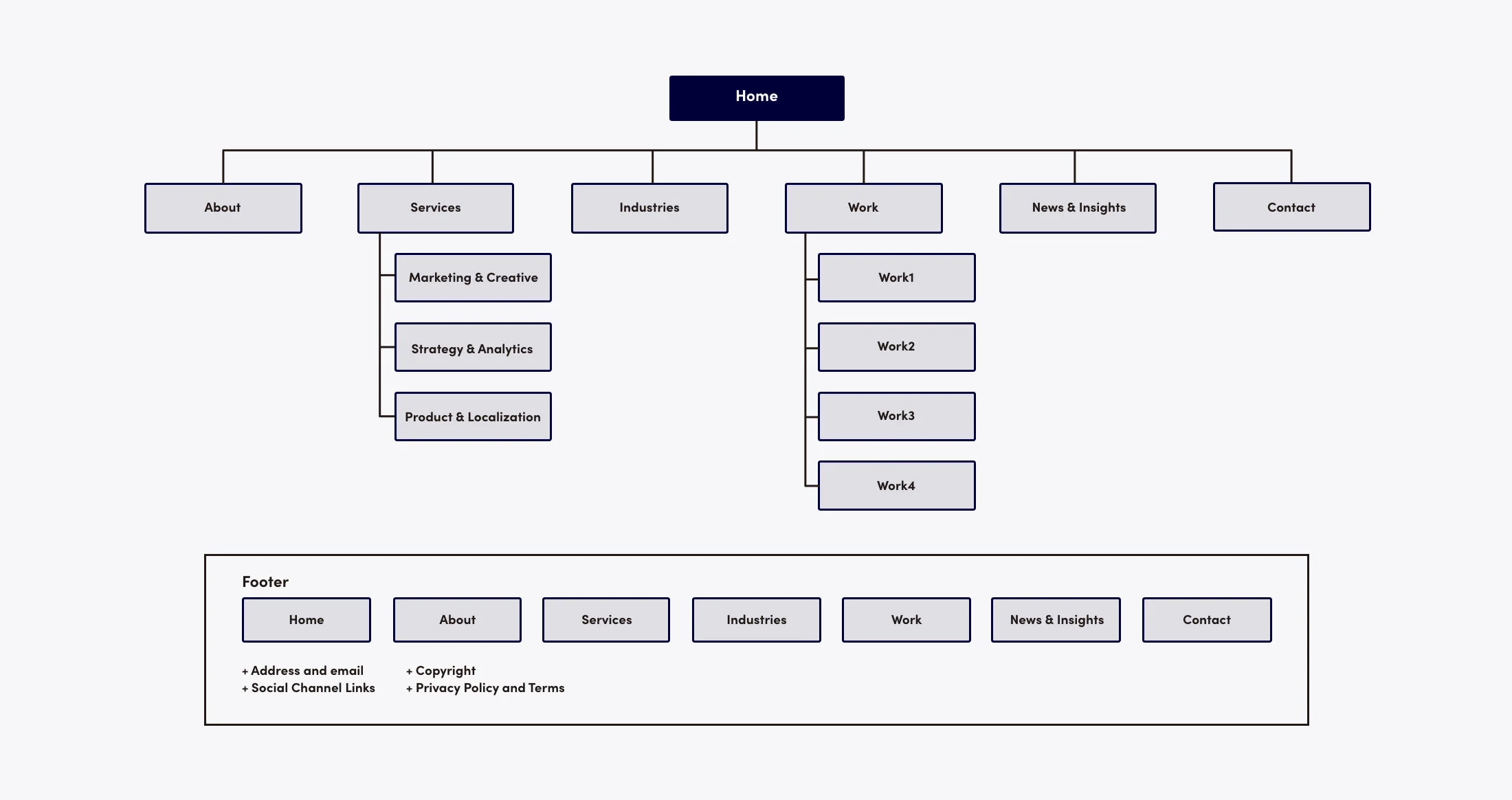
Based on the sitemap, I sketched out the entire page to figure out the volume of the whole content and focused on structuring them more clearly and simply. At the client's request, I also thought of how to visualize the company's facts and data with the use of infographics and icons. Since they offer data-driven services, presenting their expertise was also a crucial goal for the website.
Creating Wireframe and Prototype to Improve the Site Structure and Usability
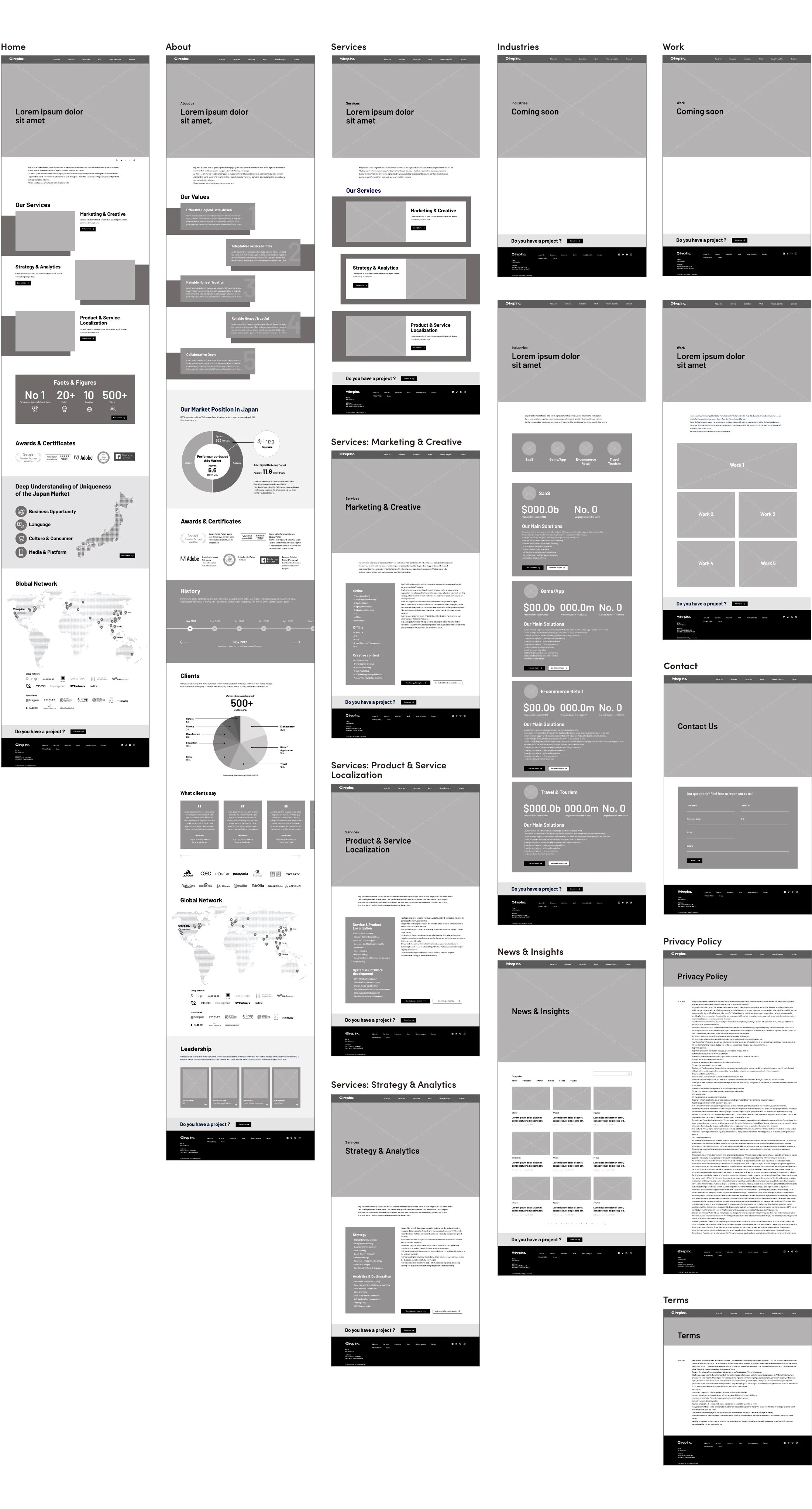
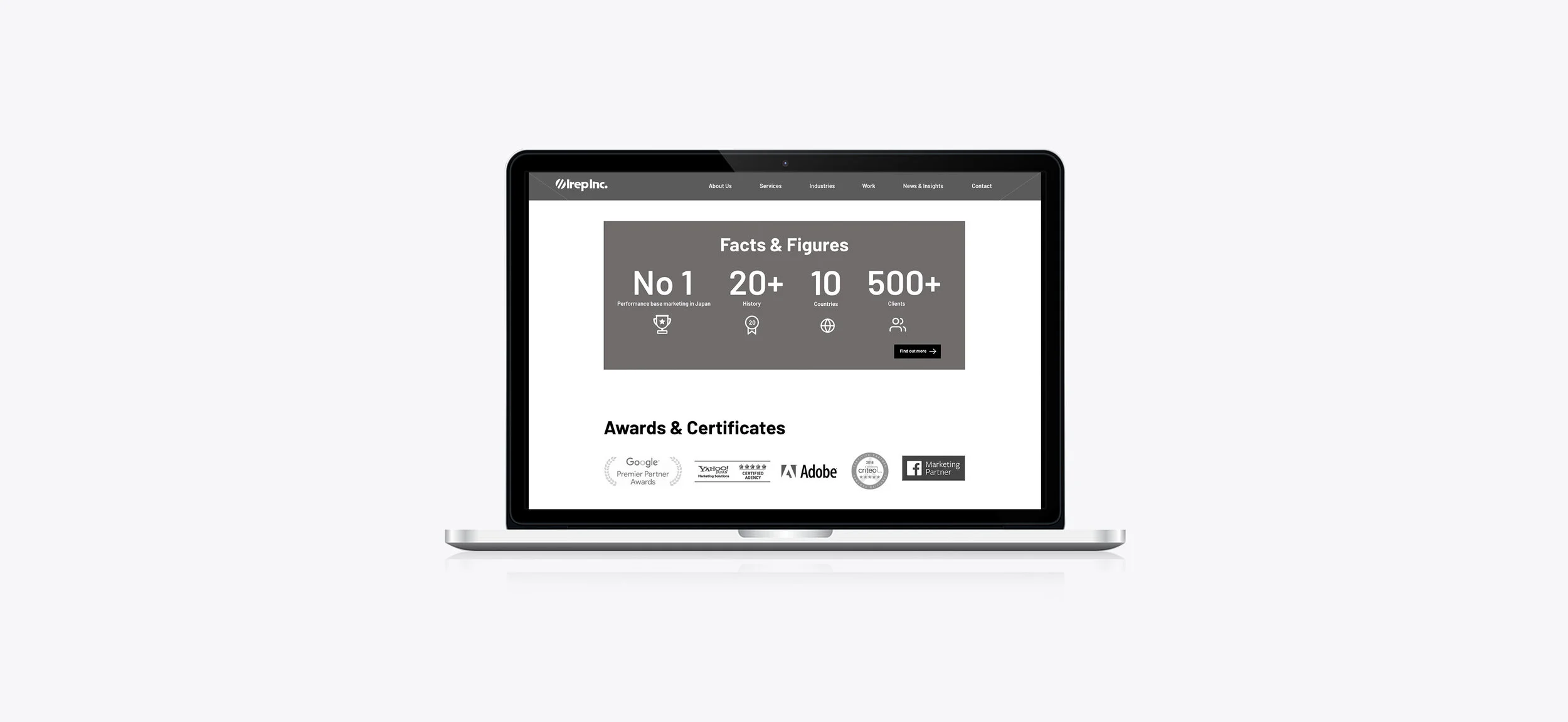
After having organized and sketched out the contents for the site, I created wireframes to present a basic structure and visualization of the user interface. I focused on displaying the information on each page with a sense of unity. Then, I further worked on a clickable prototype. At an early stage of designing, I wanted to ensure that the client understood how the contents were grouped and connected and how the navigations worked.
Interactive prototype helped them to simulate the site functionality quickly. After having determined the information architecture and intended functionality in the interface, I moved on to the visual design. User experience is affected how the website looks and users determine if it is helpful in a few seconds. Having a compelling imagery helps to make them stay focused and increase user engagement.
Building a Strong Brand Presence
Having a strong brand presence will benefit any website and works to build customer recognition. Consistent imagery creates a consistent brand identity. Although the previous site utilized bold corporate colors, however, it needed more cohesive visuals to build a strong brand identity for communicating with their audience. The client’s business offers data-driven digital solutions to international customers.
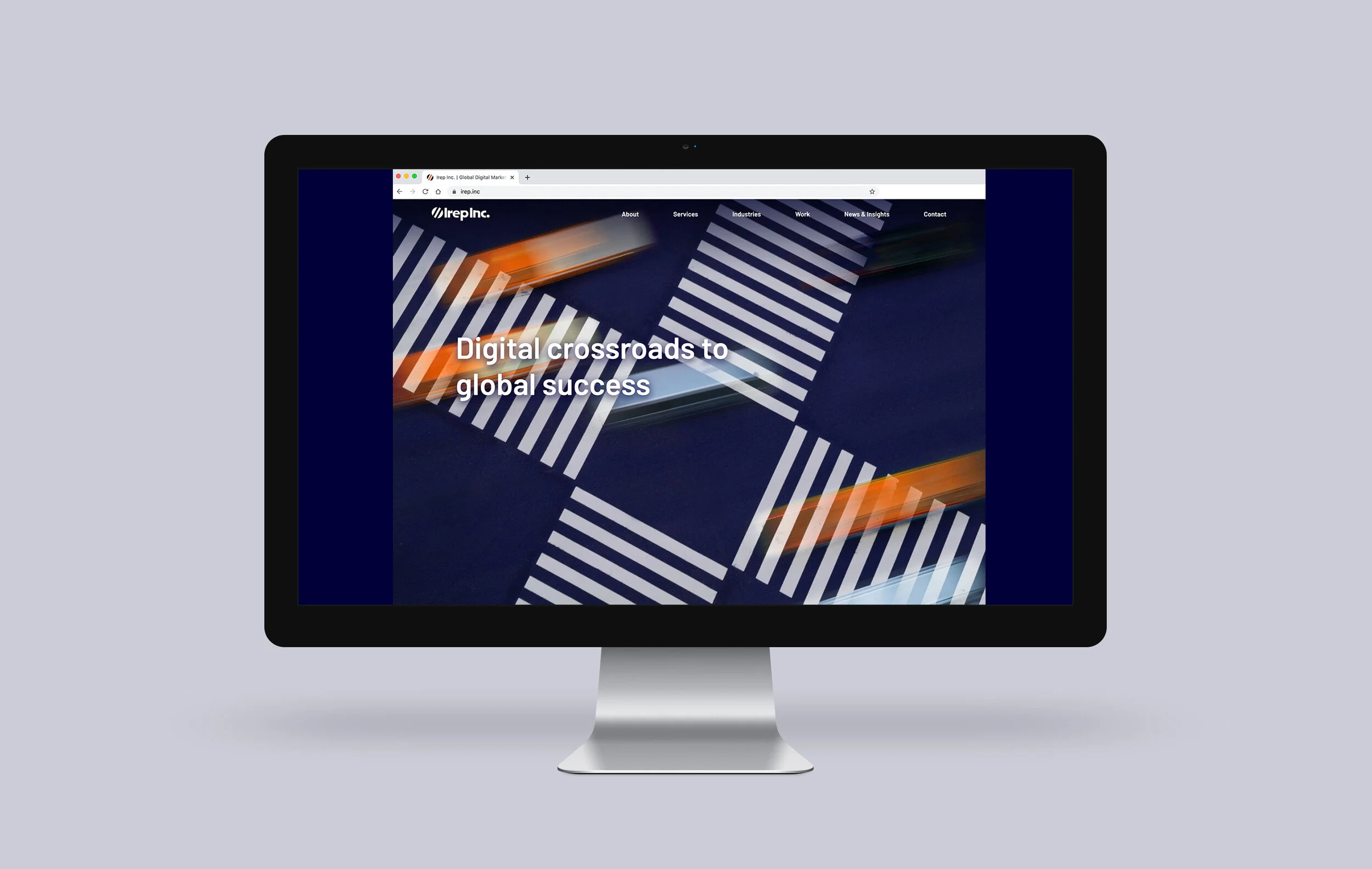
For that reason, conceptual keywords they wanted to represent as the business of expertise were “Bridge,” “Cross-border” and “Connect.” We collaborated to select the best-suited imagery to support their brand messages. Furthermore, I edited each visual by adding brand colors and also built the UI design system to create a cohesive visual presence throughout the website.
Creating Visual Design for Responsive Site
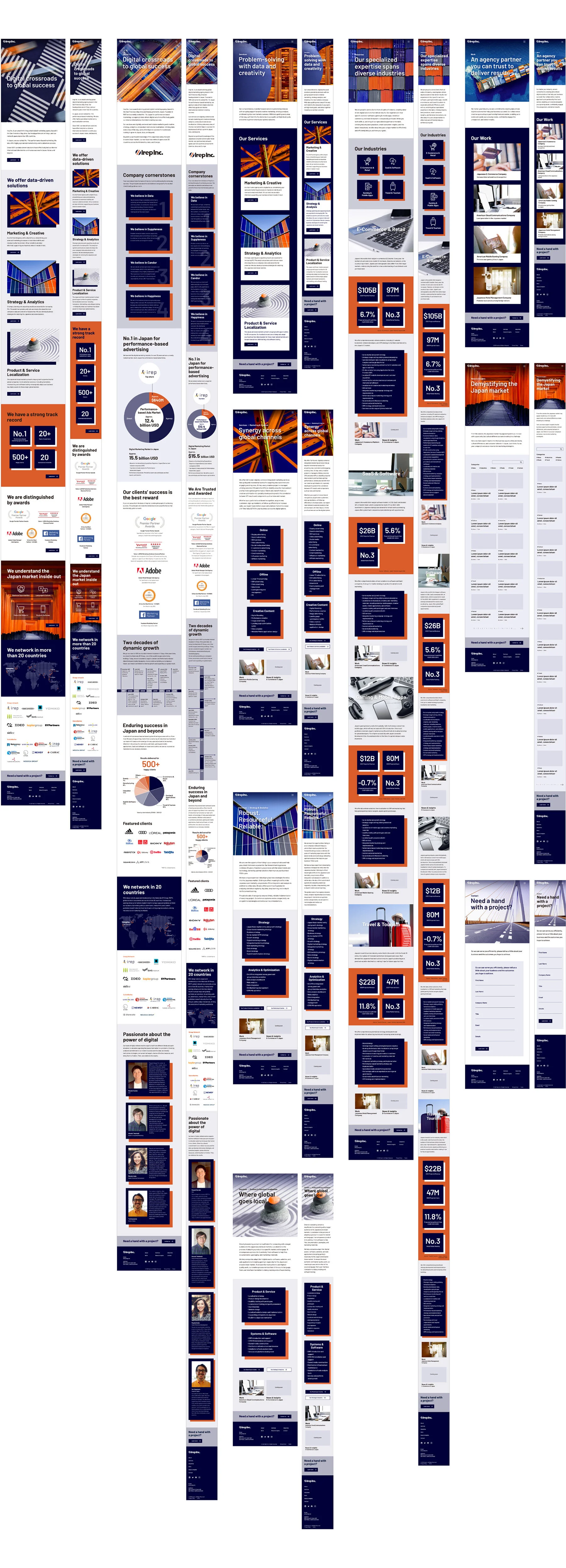
By following the design system, I prioritized creating visuals and applied UI components for the desktop version. The website is feature-rich and targeted at office-based desktop users. Following that, I created mobile versions by communicating with the developer.
With ensuring that the website keeps a consistent look across multiple platforms, I moved forward to high-fidelity prototype development to test the use by focusing on details such as flow, engagement, interactions, and navigations.
Creating High-Fidelity Prototype to Simulate the Final Product
Working on the high-fidelity prototype helped to simulate the finished product. We demonstrated interaction and functionality. The prototype gave the client a clear idea of how the website was supposed to work. Once I received approvals, I handed over the design to the developer. Before launching the website, he set up the beta site for further testing.
We checked up on implemented interactions and animations if they helped users to transition from contents and pages smoothly. We collaborated to make our final adjustments and invested quite some time in quality assurance. After having repeated proofreading and having reviewed changes, the website finally went live.
Reflection
The client was extremely pleased with the result. We improved the website in every respect, such as structures, feature contents, usability, interactions, and visuals. As a result, we succeeded in strengthening their online brand presence significantly. At every step of the project, we focused on fulfilling their requirements and achieving the goal of the website.
Although we were all in different time zones, we leveraged such conditions and communicated fully to proceed with the project. We enjoyed remote collaborations and saw great potentials thanks to the technology. We are excited to see that the website helps in increasing conversions and ultimately growing and expanding their business.


